
Creative social walls for every occasion
Explore our collection of pre-designed templates and copy/paste the CSS to apply it to your own wall.


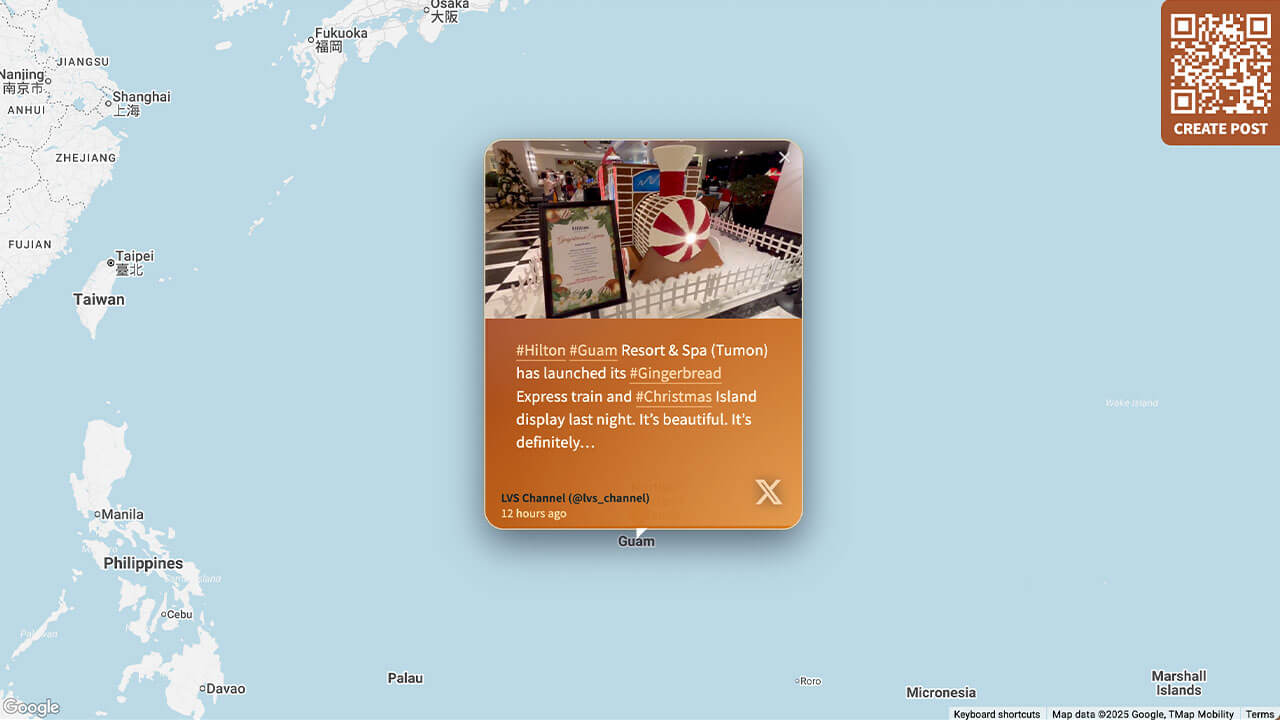
Layout Tourism
Great for organizations in the hospitality and tourism sector, and with global locations.
Customization highlights:
- Branded gradients on tiles
- Animated glow and hover on pictures/videos
- Custom location pins
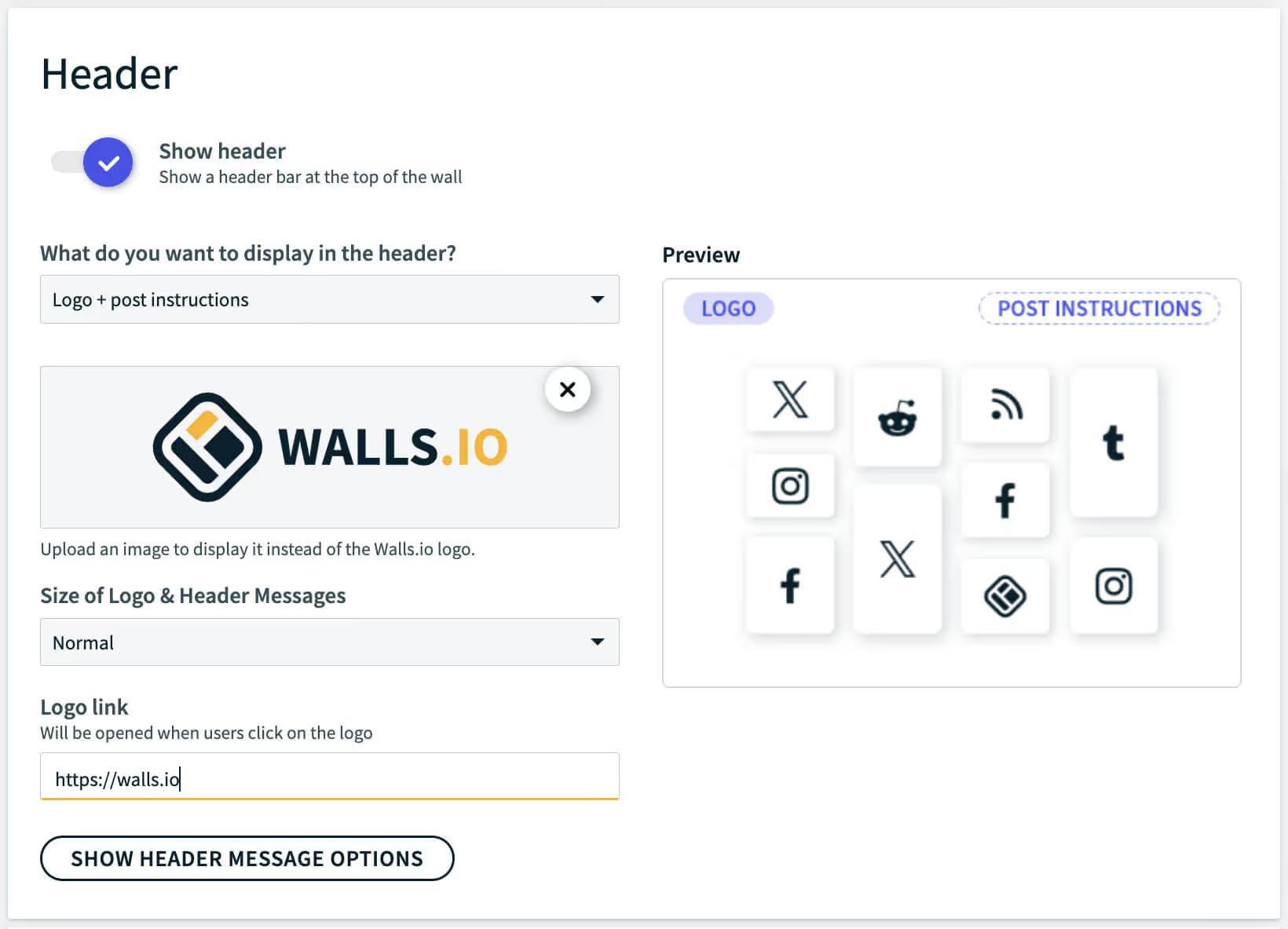
How to implement
Head to Walls.io > Settings > Design.
Go to your wallMake sure you have selected the Map Layout, hide the header, select the color scheme "Light" and the map style "Light".
Copy-paste the following CSS snippet in the Custom CSS field.
/******************************************************
  WALLS.IO — "Tourism" Theme
  • Header gradient
  • Map layout
  • Custom Create Post button
  • Hover effect on posts
  • Custom Font
******************************************************/

/* ================================
   GLOBAL FONT & BASE TWEAKS
   ================================ */

@import url('https://fonts.googleapis.com/css2?family=Nunito+Sans:wght@300;500;700&display=swap');

body {
  font-family: "Nunito Sans", system-ui, -apple-system, BlinkMacSystemFont, "Segoe UI", sans-serif;
  letter-spacing: 0.01em;
  color: #1f1309;
}

/* Smaller text size for Map posts */
.theme-map .checkin-message {
  font-size: 16px;
}
.theme-map .checkin-without-image .checkin-message {
  font-size: 16px;
}

/* ================================
   HEADER — MORE TRANSPARENT GRADIENT
   ================================ */

.socialwall_header {
  background: linear-gradient(
    135deg,
    rgba(168, 84, 45, 0.65) 0%,
    rgba(218, 140, 66, 0.55) 100%
  ) !important;
  backdrop-filter: blur(6px);
  -webkit-backdrop-filter: blur(6px);
  color: #fff !important;
}

/* Ensure header text remains readable */
.socialwall_header_title-inner,
.post_instructions,
.socialwall_header_infos {
  color: #ffffff !important;
}

/* ================================
   MAP MARKER ONLY (no map colour changes)
   ================================ */

#map img[src*="marker"] {
  background-image: url(https://cdn.prod.website-files.com/5f1175d8eef44a6c5d6661fb/692821e8626bf234453e07bd_location.svg);
  padding: 40px;
  display: block;
  box-sizing: border-box;
  width: 0px !important;
  height: 34px !important;
  padding-left: 33px !important;
  background-size: contain;
  background-repeat: no-repeat;
}

/* ================================
   POST CARDS – WARM PALETTE
   ================================ */

.theme-map .checkin {
  border-radius: 20px;
  overflow: hidden;
  background:
    radial-gradient(circle at 0% 0%, rgba(248, 250, 252, 0.16), transparent 55%),
    linear-gradient(135deg,
      rgba(127, 29, 29, 0.96) 0%,
      rgba(180, 83, 9, 0.96) 45%,
      rgba(217, 119, 6, 0.96) 100%
    );
  color: #fefce8;
  box-shadow:
    0 14px 38px rgba(15, 23, 42, 0.6),
    0 0 0 1px rgba(251, 191, 36, 0.5);
  position: relative;
  transition:
    transform 0.22s ease-out,
    box-shadow 0.22s ease-out,
    background 0.45s ease-out;
}

/* Subtle animated glow */

.theme-map .checkin::before {
  content: "";
  position: absolute;
  inset: -1px;
  background:
    radial-gradient(circle at 10% 0%, rgba(248, 250, 252, 0.24) 0, transparent 55%),
    radial-gradient(circle at 100% 100%, rgba(254, 215, 170, 0.4) 0, transparent 60%);
  mix-blend-mode: screen;
  opacity: 0.25;
  pointer-events: none;
  animation: warmGlow 9s ease-in-out infinite;
}

.theme-map .checkin:hover {
  transform: scale(1.04);
  box-shadow:
    0 20px 60px rgba(15, 23, 42, 0.95),
    0 0 0 1px rgba(251, 146, 60, 0.9);
}

.theme-map .checkin:hover::before {
  opacity: 0.7;
}

/* Cinematic images */

.theme-map .checkin-image {
  filter: saturate(1.08) contrast(1.05);
  transition: transform 0.22s ease-out, filter 0.22s ease-out;
}

.theme-map .checkin:hover .checkin-image {
  transform: scale(1.06);
  filter: saturate(1.18) contrast(1.08);
}

/* ================================
   TYPOGRAPHY INSIDE POSTS
   ================================ */

.theme-map .checkin-user {
  padding: 10px 16px 8px 16px;
  font-size: 12px;
  color: #ffedd5;
}

.theme-map .checkin-user-image {
  display: none;
}

.theme-map .checkin-user-name {
  font-weight: 600;
}

.theme-map .checkin-timestamp {
  color: rgba(254, 249, 195, 0.88);
}

.theme-map .checkin-message-wrapper {
  padding: 10px 16px 16px 16px;
}

.theme-map .checkin-message {
  line-height: 1.45;
  color: #fffbeb;
}

/* Remove big quotes on text-only posts */

.theme-map .checkin-without-image .checkin-message-wrapper:after,
.theme-map .checkin-without-image .checkin-message-wrapper:before {
  content: "";
}

.theme-map .checkin-without-image .checkin-message {
  margin-top: 14px;
  margin-bottom: 14px;
  line-height: 1.45;
  font-size: 16px;
}

/* Warm link colours */

.theme-map .checkin-message a {
  color: #fed7aa;
  text-decoration: none;
  border-bottom: 1px solid rgba(253, 186, 116, 0.8);
}

.theme-map .checkin-message a:hover {
  color: #fffbeb;
  border-bottom-color: rgba(254, 243, 199, 0.95);
}

/* Icons subtle */

.theme-map .checkin-type {
  opacity: 0.7;
  filter: drop-shadow(0 0 6px rgba(15, 23, 42, 0.75));
}

/* ================================
   CREATE POST BUTTON — CUSTOM COLORS
   ================================ */

#createPostButton {
  background-color: #a8542d !important;
}

#createPostButton:hover {
  background-color: #da8c42 !important;
}

/* ================================
   DETAIL VIEW
   ================================ */

.detail-text-wrapper {
  background:
    radial-gradient(circle at 0% 0%, rgba(250, 250, 249, 0.18), transparent 55%),
    radial-gradient(circle at 120% 120%, rgba(251, 191, 36, 0.22), transparent 60%);
}

a.detail-timestamp {
  color: rgba(148, 120, 96, 0.95);
}

/* ================================
   SMALL SCREEN TWEAKS
   ================================ */

@media screen and (max-width: 768px) {
  .theme-map .checkin {
    border-radius: 18px;
  }
  .theme-map .checkin-message {
    font-size: 15px;
  }
}

/* ================================
   ANIMATIONS
   ================================ */

@keyframes warmGlow {
  0% { opacity: 0.25; transform: translate3d(0, 0, 0); }
  50% { opacity: 0.75; transform: translate3d(4px, -4px, 0); }
  100% { opacity: 0.25; transform: translate3d(0, 0, 0); }
}
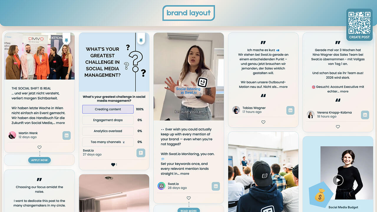
Layout Brand Hub
Great for companies who want to make a strong brand presence on their websites and displays.
Customization highlights:
- Branded gradients on tiles
- Animated hover on pictures/videos
- Branded social media icons
- Soft shadow on posts for glow effect
How to implement
Head to Walls.io > Settings > Design.
Go to your wallMake sure you have selected the Fluid Layout and the color scheme "Light".
Copy-paste the following CSS snippet in the Custom CSS field.
/******************************************************
WALLS.IO — "Brand Hub" Theme
• Header gradient and customised background
• Custom Create Post button
• Custom CTAs
• Hover effect on posts
• Custom Font
******************************************************/
/* FONT – modern retail style */
@import url('https://fonts.googleapis.com/css2?family=Poppins:wght@300;400;600;700&display=swap');
body {
font-family: "Poppins", system-ui, -apple-system, BlinkMacSystemFont, "Segoe UI", sans-serif;
color: #222222;
}
/* SUBTLE TEXTURED BACKGROUND USING BRAND COLORS */
html,
body {
background-color: #faefe6;
background-image:
radial-gradient(circle at 1px 1px, rgba(255, 255, 255, 0.7) 1px, transparent 0),
radial-gradient(circle at 3px 3px, rgba(93, 166, 191, 0.12) 1px, transparent 0);
background-size: 16px 16px, 24px 24px;
}
/* Let our own background show */
.gradient-container {
background: transparent !important;
}
/* WALL CONTAINER – soft inner glow frame */
.socialwall_container {
margin-top: 130px !important;
border-radius: 24px;
background: rgba(255, 255, 255, 0.85);
backdrop-filter: blur(14px);
-webkit-backdrop-filter: blur(14px);
box-shadow: 0 20px 60px rgba(0, 0, 0, 0.12);
outline: 1px solid rgba(93, 166, 191, 0.25);
outline-offset: -6px;
}
/* Comfortable spacing */
.theme-fluid .checkins {
gap: 22px !important;
}
/* HEADER */
.socialwall_header {
height: 110px !important;
display: flex;
align-items: center;
justify-content: center;
background: linear-gradient(
135deg,
#5da6bf 0%,
#faefe6 50%,
#5da6bf 100%
);
box-shadow: 0 10px 30px rgba(0, 0, 0, 0.15);
border-radius: 0 0 24px 24px;
padding: 12px 24px;
z-index: 1000;
}
.socialwall_header_title {
margin: 0 auto;
display: flex;
align-items: center;
justify-content: center;
}
/* Logo */
.socialwall_header.custom img.logo,
.logo {
height: 72px !important;
max-height: 72px;
width: auto;
}
/* Hide post instructions & header right column */
.post_instructions { display: none !important; }
.socialwall_header_infos { display: none; }
/* POST TEXT – general */
.theme-fluid .checkin-message {
font-size: 14px;
line-height: 1.5;
}
.theme-fluid .checkin-without-image .checkin-message {
font-size: 14px;
}
/* PINNED POSTS – ensure text is 15px */
.checkin-pinned .checkin-message,
.checkin-pinned .checkin-message-inner,
.checkin-pinned.checkin-without-image .checkin-message {
font-size: 15px !important;
}
/* POST CARDS */
.theme-fluid .checkin {
border-radius: 20px;
overflow: hidden;
background: linear-gradient(
145deg,
rgba(93,166,191,0.10),
rgba(250,239,230,0.95)
);
border: 1px solid rgba(93, 166, 191, 0.30);
box-shadow: 0 10px 30px rgba(0, 0, 0, 0.08);
position: relative;
transition: box-shadow 0.3s ease, transform 0.2s.ease;
}
.theme-fluid .checkin:hover {
box-shadow: 0 18px 45px rgba(0, 0, 0, 0.22);
transform: translateY(-2px);
}
/* Media wrapper */
.theme-fluid .checkin-image-wrapper {
border-radius: 16px 16px 0 0;
overflow: hidden;
}
/* IMAGE / VIDEO */
.theme-fluid .checkin-image,
.theme-fluid .checkin-video,
.theme-fluid .checkin-image-tag {
transition: transform 0.4s ease, filter 0.4s ease, box-shadow 0.4s ease;
transform-origin: center center;
}
.theme-fluid .checkin:hover .checkin-image,
.theme-fluid .checkin:hover .checkin-video,
.theme-fluid .checkin:hover .checkin-image-tag {
transform: scale(1.05);
filter: saturate(1.15) contrast(1.05);
box-shadow: 0 18px 40px rgba(0, 0, 0, 0.25);
}
/* CONTENT SPACING */
.theme-fluid .checkin-message-wrapper {
padding: 14px 18px 12px 18px;
}
.theme-fluid .checkin-user {
padding: 0 18px 10px 18px;
}
/* CTA BUTTON BLOCK — styled like post tiles */
.checkin-buttons {
padding: 14px 18px 14px 18px;
background: linear-gradient(
145deg,
rgba(93,166,191,0.10),
rgba(250,239,230,0.95)
);
border-radius: 20px !important;
border: 1px solid rgba(93, 166, 191, 0.30);
box-shadow: 0 6px 18px rgba(0, 0, 0, 0.04);
transition: box-shadow 0.3s ease, transform 0.2s ease;
}
/* HOVER EFFECT */
.checkin-buttons:hover {
box-shadow: 0 18px 45px rgba(0, 0, 0, 0.22) !important;
transform: translateY(-2px) !important;
}
/* Individual CTAs inside */
.checkin-buttons .checkin-cta {
background: #5da6bf;
color: #faefe6;
border-radius: 999px;
border: none;
padding: 6px 14px;
font-size: 12px;
font-weight: 600;
text-transform: uppercase;
letter-spacing: 0.05em;
box-shadow: 0 4px 10px rgba(93, 166, 191, 0.35);
cursor: pointer;
transition: background-color 0.2s ease, box-shadow 0.2s ease, transform 0.2s ease;
}
.checkin-buttons .checkin-cta:hover {
background: #4b8da3;
box-shadow: 0 6px 16px rgba(93, 166, 191, 0.45);
transform: translateY(-1px);
}
/* NETWORK ICON BADGE */
.checkin-type {
background: rgba(93, 166, 191, 0.55) !important;
border-radius: 9px !important;
font-size: 20px !important;
color: #faefe6 !important;
padding: 7px 10px !important;
display: inline-flex;
align-items: center;
justify-content: center;
}
/* PIN ICON */
.checkin-pin-icon,
.checkin-pin-icon svg,
.checkin-pin-icon path {
color: #5da6bf !important;
fill: #5da6bf !important;
}
/* CREATE POST BUTTON */
#createPostButton {
background-color: #4b8da3 !important;
color: #ffffff !important;
border-radius: 14px !important;
box-shadow: 0 10px 28px rgba(93, 166, 191, 0.45);
border: none;
top: 40px !important;
right: 24px !important;
bottom: initial !important;
left: initial !important;
}
#createPostButton span {
font-weight: 600;
color: #ffffff !important;
}
#createPostButton:hover {
background-color: #5da6bf !important;
box-shadow: 0 14px 36px rgba(93, 166, 191, 0.55);
}
/* LARGE SCREENS */
@media screen and (min-width: 1440px) {
.socialwall_header { height: 120px !important; }
.socialwall_container { margin-top: 140px !important; }
.socialwall_header.custom img.logo, .logo { height: 80px !important; }
}
/* MOBILE (standard) */
@media screen and (max-width: 640px) {
.socialwall_header { height: 90px !important; padding-inline: 12px; }
.socialwall_header.custom img.logo, .logo { height: 54px !important; }
.socialwall_container { margin-top: 105px !important; }
.theme-fluid .checkin-message { font-size: 14px; }
.checkin-buttons { padding-inline: 14px; }
}
/* 📱 MOBILE: MOVE CREATE POST BUTTON TO BOTTOM CENTER (≤ 576px) */
@media screen and (max-width: 576px) {
#createPostButton {
position: fixed !important;
bottom: 24px !important;
top: auto !important;
left: auto !important;
right: auto !important;
z-index: 9999 !important;
}
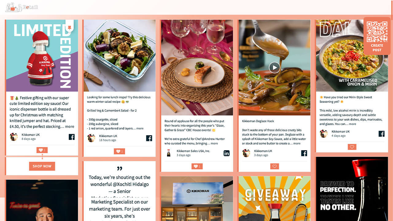
}Layout Retail
Great for companies in the retail and e-commerce sector.
Customization highlights:
- Branded background gradient
- Custom like buttons
- Custom branded CTA buttons
How to implement
Head to Walls.io > Settings > Design.
Go to your wallMake sure you have selected the Fluid Layout and the color scheme "Light".
Copy-paste the following CSS snippet in the Custom CSS field.
/******************************************************
  WALLS.IO — "Retail" Theme
  • Background gradient
  • Custom Create Post button
  • Custom Like Button
  • Custom CTAs
******************************************************/

html,
body {
  min-height: 100%;
}

html,
body,
#content,
#wallsio,
.wallsio-container,
.socialwall_wrapper,
#wallsio-app,
.wallsio-app,
.socialwall,
.theme-fluid {
  background-color: #F7B199; /* fallback */
  background-image: linear-gradient(
    135deg,
    #FFFFFF 0%,
    #F7B199 35%,
    #F3A08A 80%
  );
  background-repeat: no-repeat;
  background-size: cover;
}

/* --------------------------------------------------
   POSTS – LEFT BORDER ONLY, NO RADIUS
   + LIGHT GREY BORDER ON OTHER SIDES
-------------------------------------------------- */

.theme-fluid .checkin.checkin-color-1,
.theme-fluid .checkin-pinned.checkin-color-1 {
  border-radius: 0 !important;
  border-left: 6px solid #ED7A5B !important; /* brand border */
  border-top: 1px solid #e0e0e0 !important;
  border-right: 1px solid #e0e0e0 !important;
  border-bottom: 1px solid #e0e0e0 !important;
  padding-left: 0 !important;
  box-shadow: none !important;
}

.theme-fluid .checkin.checkin-color-1:hover,
.theme-fluid .checkin-pinned.checkin-color-1:hover {
  border-left-color: #ED7A5B !important;
}

/* --------------------------------------------------
   HEADER – PARTIALLY TRANSPARENT WHITE BACKGROUND
-------------------------------------------------- */

.socialwall_header {
  background: rgba(255, 255, 255, 0.9) !important;
  backdrop-filter: blur(6px);
  -webkit-backdrop-filter: blur(6px);
}

/* --------------------------------------------------
   CTA BUTTONS AREA (.checkin-buttons)
-------------------------------------------------- */

.theme-fluid .checkin-buttons {
  background: #ffffff !important;
  border-left: 6px solid #ED7A5B !important;
  border-top: 1px solid #e0e0e0 !important;
  border-right: 1px solid #e0e0e0 !important;
  border-bottom: 1px solid #e0e0e0 !important;
}

.theme-fluid .checkin-buttons .checkin-cta {
  background: #ED7A5B;
  color: #ffffff;
  border-radius: 0;
  border: none;
  text-transform: uppercase;
  letter-spacing: 0.04em;
  font-weight: 600;
  padding: 8px 16px;
  display: inline-block;
  transform: scale(1);
  transform-origin: center center;
  will-change: transform;
  transition:
    transform 0.2s ease-out,
    background-color 0.25s ease,
    color 0.25s ease;
}

.theme-fluid .checkin-buttons .checkin-cta:hover,
.theme-fluid .checkin-buttons .checkin-cta:focus {
  background: #f28e72;
  transform: scale(1.06) !important;
  color: #ffffff;
  box-shadow: none !important;
}

/* --------------------------------------------------
   DIRECT POSTS BUTTON (#createPostButton)
-------------------------------------------------- */

#createPostButton {
  background-color: #ED7A5B !important;
  color: #ffffff !important;
  border-radius: 12px !important;
  border: none !important;
  text-transform: uppercase;
  letter-spacing: 0.08em;
  font-weight: 700;
  padding: 5px !important;
  margin-right: 10px !important;
  transition:
    background-color 0.2s ease,
    transform 0.15s ease;
}

#createPostButton:hover {
  background-color: #f28e72 !important;
  transform: translateY(-2px);
}

#createPostButton:focus-visible {
  outline: 2px solid #ffffff;
  outline-offset: 3px;
}

/* --------------------------------------------------
   CONNECTOR — SOLID BRIGHTER BRAND COLOR
-------------------------------------------------- */

.connector,
.connector:before,
.connector:after {
  background: #F49A7F !important;
}

.connector,
.connector a,
.connector .connector__icon {
  color: #ffffff !important;
  fill: #ffffff !important;
}

/* --------------------------------------------------
   PIN ICON
-------------------------------------------------- */

.theme-fluid .checkin-pin-icon,
.theme-fluid .checkin-pin-icon svg {
  color: #ED7A5B !important;
  fill: #ED7A5B !important;
}

/* --------------------------------------------------
   LIKE BUTTON – PERFECTLY SQUARE, NO HOVER RADIUS
-------------------------------------------------- */

.theme-fluid .like-button {
  background-color: #ED7A5B !important;
  border-radius: 0 !important;
  border: none !important;
  color: #ffffff !important;
  padding: 4px 10px;
  display: inline-flex;
  align-items: center;
  justify-content: center;
  position: relative;
  overflow: hidden;
}

.theme-fluid .like-button::before,
.theme-fluid .like-button::after {
  content: none !important;
}

.theme-fluid .like-button *,
.theme-fluid .like-button *::before,
.theme-fluid .like-button *::after {
  border-radius: 0 !important;
}

.theme-fluid .like-button:hover {
  background-color: #f28e72 !important;
  border-radius: 0 !important;
  box-shadow: none !important;
}

.theme-fluid .like-button .icon {
  color: #ffffff !important;
}

.theme-fluid .like-button .icon.liked {
  color: #ffe7e0 !important;
}

.theme-fluid .like-button .icon.not-liked {
  color: #ffffff !important;
}

.theme-fluid .like-button .icon.loading {
  color: #ffffff !important;
}

/* --------------------------------------------------
   CUSTOM SCROLLBAR – CLEAN BRAND STYLE
-------------------------------------------------- */

/* Chrome, Edge, Safari */
::-webkit-scrollbar {
  width: 10px;
  height: 10px;
}

::-webkit-scrollbar-track {
  background: rgba(255, 255, 255, 0.4);
  border-radius: 10px;
}

::-webkit-scrollbar-thumb {
  background: #ED7A5B;
  border-radius: 10px;
  border: 2px solid rgba(255, 255, 255, 0.6);
}

::-webkit-scrollbar-thumb:hover {
  background: #d9684b;
}

/* Firefox */
* {
  scrollbar-width: thin;
  scrollbar-color: #ED7A5B rgba(255, 255, 255, 0.4);
}
Layout Education
Great for universities looking to create unique displays and websites for back to school, alumni events, live graduation days, and newsrooms.
Customization highlights:
- Animated background (subtle floating dots)
- Custom like buttons
- Custom pin buttons
- Animated hover on pictures/videos
- Soft shadow on posts for glow effect

How to implement
Head to Walls.io > Settings > Design.
Go to your wallMake sure you have selected the Fluid Layout and the color scheme "Light".
Copy-paste the following CSS snippet in the Custom CSS field.
/************************************************************
  WALLS.IO — "Education" Theme
  • Blue animated background
  • Images and videos hover effect
  • High contrast
************************************************************/

body {
  background: linear-gradient(
    130deg,
    #0a1b2f,
    #0e3259,
    #124c85,
    #0a1b2f
  );
  background-size: 300% 300%;
  animation: bgShift 20s ease infinite;
}

@keyframes bgShift {
  0% { background-position: 0% 50%; }
  50% { background-position: 100% 50%; }
  100% { background-position: 0% 50%; }
}

/* Subtle floating particles */
body::before {
  content: "";
  position: fixed;
  top: 0; left: 0;
  width: 100%; height: 100%;
  pointer-events: none;
  background-image: radial-gradient(rgba(255,255,255,0.18) 2px, transparent 3px);
  background-size: 120px 120px;
  opacity: 0.45;
  animation: particlesFloat 14s linear infinite;
}

@keyframes particlesFloat {
  from { transform: translateY(0px); }
  to   { transform: translateY(-200px); }
}

/* -----------------------------------------------------
📦 2) Add spacing between posts
----------------------------------------------------- */
.theme-fluid .checkin-wrapper {
  padding: 20px 10px 0px !important; /* top 20, L/R 10, bottom 0 */
}

/* -----------------------------------------------------
📦 3) Posts – blue tiles with depth
----------------------------------------------------- */
.checkin {
  border-radius: 22px;
  overflow: hidden;
  transition: transform .35s ease, box-shadow .4s ease, background .4s ease;
  background: linear-gradient(
    to bottom right,
    rgba(40, 120, 220, 0.25),
    rgba(0, 80, 160, 0.25)
  );
  box-shadow: 0 0 20px rgba(0,0,0,0.35);
}

/* Hover scale 1.06 */
.checkin:hover {
  transform: scale(1.06);
  background: linear-gradient(
    to bottom right,
    rgba(40,120,220,0.45),
    rgba(0,80,160,0.45)
  );
  box-shadow: 0 0 35px rgba(40,120,220,0.55);
}

/* Glow halo */
.checkin::after {
  content: "";
  position: absolute;
  inset: 0;
  background: radial-gradient(circle, rgba(0,140,255,0.35), transparent 70%);
  opacity: 0;
  transition: opacity .4s ease;
  pointer-events: none;
}
.checkin:hover::after { opacity: 1; }

/* -----------------------------------------------------
💙 4) Media (no mask)
----------------------------------------------------- */
.theme-fluid .checkin-image,
.theme-fluid .checkin-image-tag,
.theme-fluid .checkin-video {
  -webkit-clip-path: none !important;
  clip-path: none !important;
}

/* Media enhancement */
.checkin-image,
.checkin-video {
  transition: filter .35s ease, transform .35s ease;
  filter: brightness(1.1) contrast(1.1);
}

.checkin-image {
  -webkit-filter: grayscale(35%);
  filter: grayscale(35%);
}

.checkin:hover .checkin-image,
.checkin:hover .checkin-video {
  transform: scale(1.06);
  -webkit-filter: grayscale(0%) brightness(1.25) contrast(1.2) saturate(1.2);
  filter: grayscale(0%) brightness(1.25) contrast(1.2) saturate(1.2);
}

/* Gentle floating for videos */
.checkin-video {
  animation: slowFloat 9s ease-in-out infinite alternate;
}

@keyframes slowFloat {
  from { transform: translateY(0px); }
  to   { transform: translateY(-6px); }
}

/* -----------------------------------------------------
📝 5) Text + links — high contrast
----------------------------------------------------- */
.checkin-message,
.checkin-user,
.checkin-timestamp {
  color: #ffffff !important;
  text-shadow: 0 2px 6px rgba(0,0,0,0.75);
}

.checkin-message a,
.checkin-user a {
  color: #7bc8ff !important;
  font-weight: 700;
  text-shadow: none !important;
}
.checkin-message a:hover,
.checkin-user a:hover {
  color: #b9e4ff !important;
  text-shadow: none !important;
}

/* -----------------------------------------------------
💡 6) Header styling
----------------------------------------------------- */

/* Use our dark glass header ONLY when there is NO header image */
.socialwall_header:not(.has-header-image) {
  background: rgba(0, 30, 60, 0.55) !important;
  backdrop-filter: blur(12px);
  box-shadow: 0 0 25px rgba(0,120,255,0.45);
}

/* When there IS a header image, let Walls.io handle the background. */
.socialwall_header.has-header-image {
  backdrop-filter: none;
  box-shadow: none;
}

/* Header text always styled for readability */
.socialwall_header_title,
.socialwall_header_infos,
.socialwall_header_infos a {
  color: #ffffff !important;
  text-shadow: 0 2px 6px rgba(0,0,0,0.75);
}

/* -----------------------------------------------------
✨ Hover transition end
----------------------------------------------------- */
.checkin {
  transition: transform .35s ease;
}

/* -----------------------------------------------------
💙 7) LIKE BUTTON — LIGHT BLUE, HEART + COUNTER MATCH
----------------------------------------------------- */

.like-button {
  background: rgba(130, 200, 255, 0.35) !important;
  border-radius: 14px;
  padding: 6px 12px;
  border: 1px solid rgba(180, 230, 255, 0.65) !important;
  color: #b9e4ff !important;
}

.like-button .icon,
.icon.not-liked,
.icon.liked {
  color: #b9e4ff !important;
}

.icon.liked {
  filter: drop-shadow(0 0 3px rgba(180, 230, 255, 0.7));
}

/* ---------------------------------------------------
   DIRECT POST BUTTON
--------------------------------------------------- */
#createPostButton {
  background-color: #3c5b97;
  color: white;
}
#createPostButton:hover{
  background-color: #204271;
}
/* ---------------------------------------------------
   PIN COLOUR
--------------------------------------------------- */

.checkin-pin-icon {
  color: #3c5b97 !important;
}
Layout Fall
Great for organizations wanting to curate their social walls to the season’s events and colors.
Customization highlights:
- Header gradient
- Rounded user images
- Textured background

How to implement
Head to Walls.io > Settings > Design.
Go to your wallMake sure you have selected the Kiosk Layout and the color scheme "Dynamic".
Copy-paste the following CSS snippet in the Custom CSS field.
/************************************************************
  WALLS.IO — "🍂 Fall" Theme
  • Centered logo in header
  • Big user images
  • Post text with gradient background
************************************************************/

/* Fall gradient header */
.socialwall_header {
  background: linear-gradient(
    90deg,
    rgba(246, 179, 107, 0.35),
    rgba(255, 138, 74, 0.35),
    rgba(142, 59, 102, 0.35)
  );
  border-bottom: 1px solid rgba(255, 220, 190, 0.2);
  box-shadow: 0 8px 24px rgba(0,0,0,0.45);
  display: flex;
  align-items: center;
  justify-content: center;
}

/* Center the logo wrapper */
.socialwall_header_title {
  margin: 0 auto;
}

/* Hide post instructions */
.socialwall_header_infos {
  display: none !important;
}

/* Hide built-in app logo variants */
.socialwall_logo,
.app-logo.app-logo,
.app-logo.app-logo img {
  display: none !important;
}

/* Make sure wrappers don’t constrain alignment */
.socialwall_header_title,
.socialwall_header_title a {
  display: flex !important;
  align-items: center !important;
  justify-content: center !important;
}

/* Push posts down to prevent overlap with 100px header */
.socialwall_container {
  margin-top: 115px !important;
}


/* ====================================================
   🍂 USER IMAGE — 100px, square rounded
==================================================== */

.checkin-user-image img,
.checkin-user-image {
  width: 100px;
  height: 100px;
  border-radius: 14px;
  object-fit: cover;
  border: 3px solid rgba(246,179,107,0.75);
  margin: 0 auto;
  display: block;
}


/* ====================================================
   🍂 USER INFO — Block layout, centered group, left text
==================================================== */

.theme-kiosk .checkin-user {
  display: block;
  font-size: 14px;
  text-align: center;
  line-height: 1.2;
  margin-top: 8px;
}

.theme-kiosk .checkin-user-name,
.theme-kiosk .checkin-user-name a,
.theme-kiosk .checkin-timestamp {
  font-size: 14px !important;
  display: block;
  margin-top: 4px;
  text-align: left !important;
  margin-left: auto;
  margin-right: auto;
  width: fit-content;
}


/* ====================================================
   🍂 TEXT AREA — Centered, rounded gradient, 0.77em text
==================================================== */

.theme-kiosk .checkin-message-wrapper {
  background: linear-gradient(
    135deg,
    rgba(246, 179, 107, 0.9) 0%,
    rgba(255, 138, 74, 0.93) 35%,
    rgba(228, 84, 77, 0.93) 70%,
    rgba(142, 59, 102, 0.95) 100%
  );

  padding: 20px 24px;
  margin: 14px;
  border-radius: 20px;
  text-align: center;
}

.theme-kiosk .checkin-message,
.theme-kiosk .checkin-message-inner {
  color: #1b0c08;
  font-size: 0.77em !important;
  line-height: 1.5;
  text-align: center;
}

.theme-kiosk .checkin-message a {
  color: #4b280f;
  font-weight: 600;
  border-bottom: 1px solid rgba(75, 40, 15, 0.4);
  text-decoration: none;
}

.theme-kiosk .checkin-message a:hover {
  border-bottom-color: rgba(75, 40, 15, 0.8);
}

/* ---------------------------------------------------
   DIRECT POST BUTTON
--------------------------------------------------- */
#createPostButton {
  background-color: #4b280f;
  color: white;
}
#createPostButton:hover{
  background-color: #1b0c08;
}
/* ---------------------------------------------------
   PIN COLOUR
--------------------------------------------------- */

.checkin-pin-icon {
  color: #4b280f !important;
}
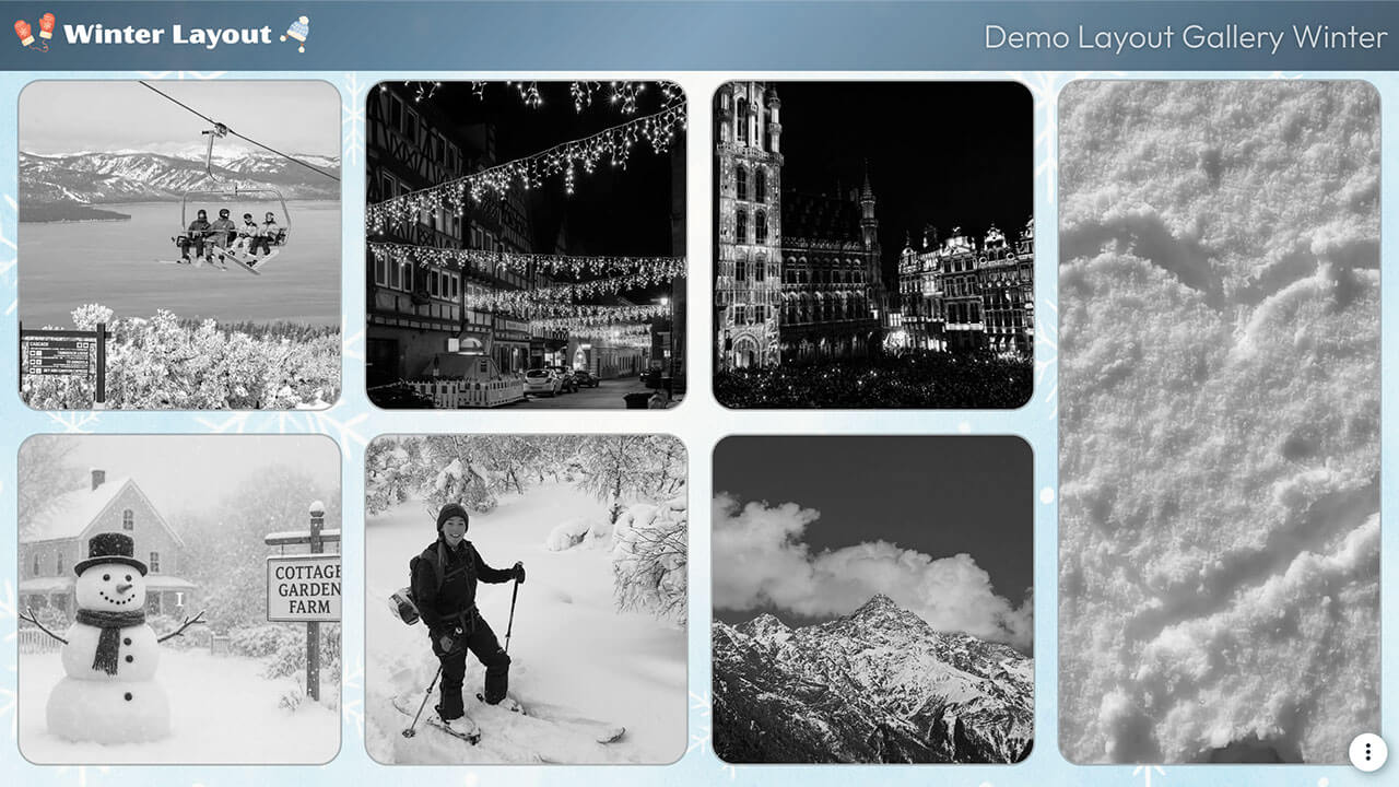
Layout Winter
Great for organizations wanting to curate their social walls to the season’s events and colors.
Customization highlights:
- Grayscale images that go full color on hover
- Animated pulse effect on tile borders
- Custom link colors
- Branded gradient on header
How to implement
Head to Walls.io > Settings > Design.
Go to your wallMake sure you have selected the Bricks Layout and the color scheme "Custom".
Download the background image and add it to the field "Background image".
Copy-paste the following CSS snippet in the Custom CSS field.
/******************************************************
  WALLS.IO — "Winter" Theme
  • Background image
  • Grayscale images going full colour when hover
  • Gradient header
  • Custom Font
******************************************************/

/* --------------------------------------------------
   IMPORT FONT — OUTFIT
-------------------------------------------------- */
@import url('https://fonts.googleapis.com/css2?family=Outfit:wght@300;400;500;600;700&display=swap');

/* --------------------------------------------------
   BASE TYPOGRAPHY
-------------------------------------------------- */
body {
  font-family: "Outfit", sans-serif !important;
  color: #e8f7ff;
  /* background image handled in Walls.io settings */
}

/* --------------------------------------------------
   HEADER – EXACTLY 9vh + WINTER GRADIENT
-------------------------------------------------- */
.socialwall_header {
  height: 9vh !important;
  min-height: 9vh !important;
  max-height: 9vh !important;

  /* soft frosty blue-to-navy gradient */
  background: linear-gradient(
    135deg,
    rgba(10, 31, 51, 0.70) 0%,        /* deep frosty navy */
    rgba(32, 96, 140, 0.55) 50%,      /* icy blue */
    rgba(10, 31, 51, 0.70) 100%       /* back to deep navy */
  ) !important;

  backdrop-filter: blur(4px);
}

/* header text */
.socialwall_header_title,
.post_instructions {
  color: #e8f7ff !important;
  font-weight: 500 !important;
  text-shadow: 0 0 6px rgba(0,0,0,0.3);
}

/* header links */
.socialwall_header a {
  color: #7cd2ff !important;
  text-decoration: none;
}

.socialwall_header a:hover {
  color: #b2ecff !important;
}

/* --------------------------------------------------
   CONTAINER – LEAVE LAYOUT ALONE (VERY IMPORTANT)
-------------------------------------------------- */
.socialwall_container {
  /* intentionally empty */
}

/* --------------------------------------------------
   TEXT & LINK COLORS IN POSTS
-------------------------------------------------- */
.checkin-message,
.checkin-user,
.checkin-timestamp {
  color: #e8f7ff !important;
}

.checkin-message a,
.checkin-user a,
.checkin-timestamp a {
  color: #7cd2ff !important;
  text-decoration: none !important;
}

.checkin-message a:hover,
.checkin-user a:hover {
  color: #b2ecff !important;
}

/* --------------------------------------------------
   POSTS — BORDER + ROUNDED CORNERS
-------------------------------------------------- */
.theme-bricks .checkin {
  border-radius: 22px !important;
  border: 2px solid rgba(255,255,255,0.25) !important;
  background: rgba(0,0,0,0.35) !important;
  overflow: hidden;
  position: relative;
}

/* --------------------------------------------------
   BORDER PULSE ANIMATION ON HOVER
-------------------------------------------------- */
.theme-bricks .checkin::after {
  content: "";
  position: absolute;
  inset: 0;
  border-radius: inherit;
  pointer-events: none;

  border: 2px solid rgba(124,210,255,0);
  box-shadow: 0 0 0 rgba(124,210,255,0);
  opacity: 0;

  transition: opacity 0.25s ease;
}

.theme-bricks .checkin:hover::after {
  opacity: 1;
  animation: borderPulse 1.4s ease-in-out infinite;
}

@keyframes borderPulse {
  0% {
    border-color: rgba(124,210,255,0.2);
    box-shadow: 0 0 6px rgba(124,210,255,0.3),
                0 0 10px rgba(178,236,255,0.2);
  }
  50% {
    border-color: rgba(124,210,255,0.9);
    box-shadow: 0 0 16px rgba(124,210,255,0.8),
                0 0 26px rgba(178,236,255,0.6);
  }
  100% {
    border-color: rgba(124,210,255,0.2);
    box-shadow: 0 0 6px rgba(124,210,255,0.3),
                0 0 10px rgba(178,236,255,0.2);
  }
}

/* --------------------------------------------------
   BLACK & WHITE → COLOR ON HOVER FOR MEDIA
-------------------------------------------------- */
.theme-bricks .checkin-image,
.theme-bricks .checkin-video,
.theme-bricks .checkin-image-tag {
  filter: grayscale(100%) !important;
  -webkit-filter: grayscale(100%) !important;
  transition: filter 0.4s ease, -webkit-filter 0.4s ease;
}

.theme-bricks .checkin:hover .checkin-image,
.theme-bricks .checkin:hover .checkin-video,
.theme-bricks .checkin:hover .checkin-image-tag {
  filter: grayscale(0%) !important;
  -webkit-filter: grayscale(0%) !important;
}

/* ---------------------------------------------------
   DIRECT POST BUTTON
--------------------------------------------------- */
#createPostButton {
  background-color: #647b8d;
  color: white;
}
#createPostButton:hover{
  background-color: #91d0fb;
}
/* ---------------------------------------------------
   PIN COLOUR
--------------------------------------------------- */

.checkin-pin-icon {
  color: #91d0fb !important;
}
Layout Celebration
Great for organizations wanting to celebrate their achievements, memories, and anniversaries. Useful for employer branding and internal HR initiatives.
Customization highlights:
- Animated clapping hands reaction button
- Semi-transparent header
- Changing tile border color on hover
- Soft shadow on posts for glow effect

How to implement
Head to Walls.io > Settings > Design.
Go to your wallMake sure you have selected the Fluid Layout and the color scheme "Light".
Copy-paste the following CSS snippet in the Custom CSS field.
/************************************************************
WALLS.IO — "🎉 Celebration" Theme
• Google Font
• Warm orange palette
• Clapping hands like button
************************************************************/
/* Google font */
@import url('https://fonts.googleapis.com/css2?family=Poppins:wght@400;600&display=swap');
:root {
--ink: #1e1f23;
--muted: #667085;
--accent: #ff9757; /* warm orange */
--accent-light: #ffb985;
--tile: rgba(255, 255, 255, 0.92);
--shadow: rgba(0, 0, 0, 0.08);
--clap-outline: url("https://cdn.prod.website-files.com/5f1175d8eef44a6c5d6661fb/691af77460b4ad87095065c5_hands-clapping-outline.svg");
--clap-solid: url("https://cdn.prod.website-files.com/5f1175d8eef44a6c5d6661fb/691af77479d3dfd424553649_hands-clapping-solid.svg");
}
/* ---------------------------------------------------
BACKGROUND
--------------------------------------------------- */
body {
font-family: "Poppins", system-ui, -apple-system, Segoe UI, Roboto, Helvetica, Arial, sans-serif;
color: var(--ink);
background: linear-gradient(
135deg,
#fff7f9 0%,
#fff1e3 35%,
#f9fbff 70%,
#fff9f2 100%
);
background-attachment: fixed;
}
body::after,
body::before { content: none !important; }
/* ---------------------------------------------------
HEADER
--------------------------------------------------- */
.socialwall_header {
background: rgba(255,255,255,0.85);
backdrop-filter: blur(10px);
border-radius: 0 0 18px 18px;
box-shadow: 0 6px 18px var(--shadow);
padding: 10px 0;
}
.socialwall_header_title,
.socialwall_header_infos { color: var(--ink) !important; }
.socialwall_header a {
color: var(--accent) !important;
text-decoration: none;
}
.socialwall_header a:hover {
color: var(--accent-light) !important;
}
/* ---------------------------------------------------
POSTS
--------------------------------------------------- */
.theme-fluid .checkin {
background: var(--tile);
border-radius: 20px;
border: 2px solid transparent;
box-shadow: 0 4px 12px var(--shadow);
transition: transform .25s ease, box-shadow .25s ease, border-color .25s ease;
}
/* One-time border pulse */
.theme-fluid .checkin:hover {
transform: translateY(-3px);
box-shadow: 0 8px 22px rgba(0,0,0,0.16);
animation: borderPulse 1.3s ease-in-out 1;
}
@keyframes borderPulse {
0% { border-color: rgba(255,151,87,0.2); }
50% {
border-color: rgba(255,151,87,0.7);
box-shadow:
0 0 0 1px rgba(255,151,87,0.35),
0 12px 28px rgba(0,0,0,0.18);
}
100% { border-color: rgba(255,151,87,0.2); }
}
.theme-fluid .checkin-image-wrapper {
border-radius: 20px 20px 0 0;
overflow: hidden;
}
.theme-fluid .checkin-image {
border-radius: 20px 20px 0 0;
object-fit: cover;
}
.theme-fluid .checkin-message {
font-size: 15px;
line-height: 1.5;
color: var(--ink);
padding: 12px 16px 0 16px;
}
.theme-fluid .checkin-user {
color: var(--muted);
font-weight: 500;
padding: 6px 16px 12px 16px;
font-size: 13px;
margin-top: 15px;
}
/* ---------------------------------------------------
REACTIONS AREA
--------------------------------------------------- */
.user-reactions-wrapper {
display: inline-flex;
align-items: center;
gap: 8px;
margin: 8px 14px 14px;
}
/* ---------------------------------------------------
⭐ UPDATED LIKE BUTTON
--------------------------------------------------- */
.like-button {
display: inline-flex;
align-items: center;
gap: 6px;
padding: 8px 10px;
border-radius: 999px;
background: rgba(0,0,0,0.05);
border: 2px solid var(--accent);
color: var(--accent);
font-weight: 700;
backdrop-filter: none;
box-shadow: none !important;
transition: transform 0.16s ease, background 0.2s ease, border-color 0.2s ease;
}
.like-button:hover {
transform: translateY(-1px);
background: rgba(0,0,0,0.08);
}
/* ---------------------------------------------------
👏 CLAPPING HANDS (recolorable)
--------------------------------------------------- */
.like-button .icon:not(.loading) * {
opacity: 0 !important;
}
.like-button .icon {
width: 18px;
height: 18px;
position: relative;
}
/* Outline */
.like-button .icon.not-liked::before {
content: "";
position: absolute; inset: 0;
mask-image: var(--clap-outline);
-webkit-mask-image: var(--clap-outline);
mask-size: contain; -webkit-mask-size: contain;
mask-repeat: no-repeat; mask-position: center;
-webkit-mask-repeat: no-repeat; -webkit-mask-position: center;
background-color: var(--accent);
opacity: .9;
}
/* Solid */
.like-button .icon.liked::before {
content: "";
position: absolute; inset: 0;
mask-image: var(--clap-solid);
-webkit-mask-image: var(--clap-solid);
mask-size: contain; -webkit-mask-size: contain;
mask-repeat: no-repeat; mask-position: center;
background-color: var(--accent);
}
/* Glow + heartbeat */
.like-button .icon.liked {
animation: heartBeat 2s ease-in-out infinite;
filter: drop-shadow(0 0 8px color-mix(in srgb, var(--accent), white 35%));
}
@keyframes heartBeat {
0%,100% { transform: scale(1); }
15% { transform: scale(1.2); }
30% { transform: scale(1.05); }
45% { transform: scale(1.15); }
60% { transform: scale(1.0); }
}
.like-button .count {
color: var(--accent); /* match button text color */
font-weight: 700; /* bold */
letter-spacing: 0.2px;
}
/* Spinner */
.like-button .icon.loading {
opacity: 1;
background-image:
radial-gradient(circle at 50% 50%, var(--accent) 30%, transparent 31%),
conic-gradient(from 0deg, #fff 0 50%, transparent 50% 100%);
background-size: 18px 18px;
background-position: center;
}
.like-button .icon.loading use { opacity: 0; }
/* ---------------------------------------------------
CLEANUP
--------------------------------------------------- */
.no-more-posts { display: none !important; }
/* ---------------------------------------------------
DIRECT POST BUTTON
--------------------------------------------------- */
#createPostButton {
background-color: #ff9757;
color: white;
}
#createPostButton:hover{
background-color: #ffb985;
}
/* ---------------------------------------------------
PIN COLOUR
--------------------------------------------------- */
.checkin-pin-icon {
color: #ff9757 !important;
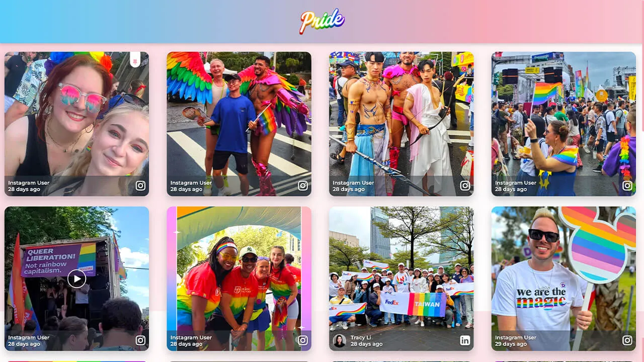
}Layout Pride
Great for diversity-related events/social topics that companies want to express their commitment to.
Customization highlights:
- Animated gradient header
- Animated background (changing colors)
- Wobble effect on tiles
- Soft shadow on posts for glow effect
How to implement
Head to Walls.io > Settings > Design.
Go to your wallMake sure you have selected the Grid Layout and the color scheme "Classic".
Copy-paste the following CSS snippet in the Custom CSS field.
/************************************************************
  WALLS.IO — "💙🤍💗 Pride" Theme
  • Animated gradient header & background
  • Image/video hover glow
  • Square tile sizing
  • Custom "No more posts" message
************************************************************/

@import url('https://fonts.googleapis.com/css2?family=Montserrat:wght@400;600&display=swap');

/* --- Palette tokens --- */
:root {
  --t-blue:  #5BCEFA;
  --t-pink:  #F5A9B8;
  --t-white: #FFFFFF;

  --header-text: #fff;
  --logo-max-height: 88px;
  --header-padding-y: 14px;
  --tile-radius: 16px;
}

/* --- Animated TRANS background (under header too) --- */
body {
  font-family: "Montserrat", system-ui, -apple-system, Segoe UI, Roboto, sans-serif;
  position: relative;
}
body::before {
  content: "";
  position: fixed; inset: 0; z-index:-1;
  background: linear-gradient(135deg,
    var(--t-blue), var(--t-pink), var(--t-white), var(--t-pink), var(--t-blue)
  );
  background-size: 400% 400%;
  animation: transBg 22s ease-in-out infinite;
}
@keyframes transBg{
  0%{background-position:0% 50%}
  50%{background-position:100% 50%}
  100%{background-position:0% 50%}
}

/* --- Header: animated trans gradient + centered logo --- */
:root {
  --header-gradient: linear-gradient(90deg,
    var(--t-blue), var(--t-pink), var(--t-white), var(--t-pink), var(--t-blue)
  );
}
.socialwall_header{
  background: var(--header-gradient);
  background-size: 300% 300%;
  animation: headerShimmer 10s linear infinite;
  color: var(--header-text);
  border:none;
  box-shadow:0 3px 10px rgba(0,0,0,.2);
  padding-top:var(--header-padding-y) !important;
  padding-bottom:var(--header-padding-y) !important;
  min-height:calc(var(--logo-max-height) + (var(--header-padding-y) * 2));
}
@keyframes headerShimmer {
  0%{background-position:0% 50%}
  50%{background-position:100% 50%}
  100%{background-position:0% 50%}
}

/* Center logo */
.socialwall_header_title{
  margin:0 auto !important;
  text-align:center !important;
  width:100% !important;
}
.socialwall_header_infos{ display:none !important; }
.logo,
.socialwall_header .logo,
.socialwall_header img.logo{
  display:block;
  margin:0 auto !important;
  max-height:var(--logo-max-height) !important;
  height:auto !important;
  width:auto !important;
  max-width:min(80vw,760px);
  object-fit:contain;
}
@media(max-width:480px){
  .logo{ width:160px; max-height:64px !important; }
}

/* --- Keep posts safely below the header --- */
.socialwall_container{
  padding-top:48px !important;
}

/* --- Tile styling --- */
.theme-grid .checkin{
  border-radius:var(--tile-radius);
  overflow:hidden;
  background:rgba(255,255,255,0.10);
  backdrop-filter:blur(4px);
  box-shadow:0 10px 20px rgba(0,0,0,0.22);
  transition:transform .3s ease, box-shadow .3s ease;
  will-change:transform;
}

/* --- Independent gentle motion per tile --- */
.theme-grid .checkin{
  --fx:0px; --fy:6px; --frot:0deg; --fdur:7s; --fdel:0s;
  animation:wobble var(--fdur) ease-in-out var(--fdel) infinite;
}
@keyframes wobble{
  0%{transform:translate(0,0) rotate(0deg);}
  25%{transform:translate(calc(var(--fx)*.6), calc(var(--fy)*.4)) rotate(calc(var(--frot)*.4));}
  50%{transform:translate(var(--fx), var(--fy)) rotate(var(--frot));}
  75%{transform:translate(calc(var(--fx)*.3), calc(var(--fy)*-.3)) rotate(calc(var(--frot)*-.3));}
  100%{transform:translate(0,0) rotate(0deg);}
}

/* Hover lift */
.theme-grid .checkin:hover,
.theme-grid .checkin:focus-visible{
  animation-play-state:paused;
  transform:scale(1.05);
  box-shadow:0 0 25px rgba(255,255,255,0.6);
}

/* --- Media hover glow --- */
.theme-grid .checkin-image-wrapper,
.theme-grid .checkin-video{
  flex:1 1 auto;
  min-height:0;
}
.theme-grid .checkin-image-wrapper img,
.theme-grid .checkin-video video{
  width:100%; height:100%;
  object-fit:cover;
  border-radius:calc(var(--tile-radius) - 4px);
  transition:transform .4s ease, filter .4s ease;
  filter:brightness(1.05) saturate(1.3);
}
.theme-grid .checkin:hover .checkin-image-wrapper img,
.theme-grid .checkin:hover .checkin-video video{
  transform:scale(1.04);
  filter:brightness(1.2) saturate(1.6)
    drop-shadow(0 0 12px rgba(255,255,255,0.8));
}

/* --- Text overlay only on hover --- */
.theme-grid .checkin-message-wrapper{
  opacity:0;
  visibility:visible !important;
  transition:opacity .25s ease;
}
.theme-grid .checkin:hover .checkin-message-wrapper{
  opacity:1;
}

/* --- Emoji fix --- */
.theme-grid .checkin-message img,
.detail-message img{
  max-width:1em;
  max-height:1em;
  vertical-align:-0.15em;
}

/* --- Text styles --- */
.theme-grid .checkin-message,
.checkin-user,
.checkin-timestamp{
  color:#fff !important;
  text-shadow:0 1px 3px rgba(0,0,0,.6);
}

/* --- NEW: Solid Colour “No more posts” --- */
.no-more-posts-inner {
  background: var(--t-blue) !important;
  color: #fff !important;
  font-weight: 700;
  padding: 14px 26px !important;
  border-radius: 14px;
  text-transform: uppercase;
  letter-spacing: 0.6px;
  box-shadow: 0 0 14px rgba(91,206,250,0.45);
  backdrop-filter: blur(6px);
  display: inline-block;
}

/* --- Accessibility --- */
.checkin:focus-visible{
  outline:3px solid #fff; outline-offset:2px;
}

/* ==============================
   OFFICIAL SQUARE-TILES SNIPPET
   ============================== */
.theme-grid .checkin-wrapper{
  height:98vw !important;
  width:98vw !important;
  padding:2vw;
  margin-left:auto;
  margin-right:auto;
}
@media(min-width:580px){
  .theme-grid .checkin-wrapper{
    height:49vw !important;
    width:49vw !important;
    padding:1vw;
  }
}
@media(min-width:960px){
  .theme-grid .checkin-wrapper{
    height:32vw !important;
    width:32vw !important;
    padding:0.8vw;
  }
}
@media(min-width:1280px){
  .theme-grid .checkin-wrapper{
    height:24vw !important;
    width:24vw !important;
    padding:0.8vw;
  }
}

/* ======================================
   CUSTOM SCROLLBAR
   ====================================== */
::-webkit-scrollbar{
  width:12px; height:12px;
}
::-webkit-scrollbar-track{
  background:rgba(91,206,250,0.25);
  border-radius:10px;
}
::-webkit-scrollbar-thumb{
  background:var(--t-pink);
  border-radius:10px;
  border:2px solid rgba(255,255,255,0.6);
}
::-webkit-scrollbar-thumb:hover{
  background:var(--t-white);
  border-color:var(--t-pink);
  box-shadow:0 0 6px rgba(245,169,184,0.8);
}

/* Firefox */
*{
  scrollbar-width:thin;
  scrollbar-color:var(--t-pink) rgba(91,206,250,0.25);
}
/* ======================================
   PINNED POST ICON — no shadow
   ====================================== */
.checkin-pin-icon {
  color: var(--t-pink) !important;
  text-shadow: none !important;
}
.checkin-pin-icon svg,
.checkin-pin-icon path {
  fill: var(--t-pink) !important;
}

/* ======================================
   CREATE POST BUTTON — blue, left-rounded, no glow
   ====================================== */
#createPostButton {
  background-color: var(--t-blue) !important;
  color: #fff !important;
  border: none !important;
  border-radius: 14px 0 0 14px !important; /* left curve only */
  box-shadow: none !important;
  font-weight: 700;
}

/* hover / focus */
#createPostButton:hover,
#createPostButton:focus-visible {
  background-color: var(--t-pink) !important;
  box-shadow: none !important;
}
Layout Sports
Great for sports organizations who want to make unique displays on jumbo screens and websites.
Customization highlights:
- Branded gradients on tiles
- Animated hover on pictures/videos
- Semi-transparent header

How to implement
Head to Walls.io > Settings > Design.
Go to your wallMake sure you have selected the Fluid Layout and the color scheme "Light".
Copy-paste the following CSS snippet in the Custom CSS field.
/************************************************************
WALLS.IO — "Live Sports" Theme
• Stadium background
• Bright accent color for header links & hashtags
• Customised Like Button
************************************************************/
/* 1) Theme tokens */
:root {
--club-primary: #0b5; /* pitch green */
--club-secondary: #0a2a4a; /* deep navy */
--club-accent: #ffd100; /* match-day yellow */
--ink: #ffffff; /* pure white text */
--ink-muted: #b9d4cc;
--card-bg: #0f1c2a;
--shadow: 0 10px 30px rgba(0,0,0,.35);
--radius-xl: 22px;
}
/* 2) Stadium backdrop */
html, body {
background:
radial-gradient(1200px 500px at 50% -10%, rgba(255,255,255,.10), transparent 60%),
radial-gradient(900px 400px at 50% 110%, rgba(255,255,255,.08), transparent 55%),
/* floodlights grid */
repeating-radial-gradient(circle at 10% 5%, rgba(255,255,255,.06) 0 2px, transparent 2px 12px),
/* pitch stripes */
repeating-linear-gradient(to bottom, rgba(255,255,255,.03) 0 60px, rgba(0,0,0,.06) 60px 120px),
linear-gradient(180deg, var(--club-secondary), #061521 60%, #04101a);
color: var(--ink);
}
/************************************************************
3) Header — translucent + accent scarf + visible links
************************************************************/
.socialwall_header {
position: sticky;
top: 0;
z-index: 999;
height: 80px;
display: flex;
align-items: center;
gap: 16px;
padding: 10px 18px !important;
color: var(--ink);
background: linear-gradient(180deg, rgba(10,42,74,.92), rgba(10,42,74,.72));
backdrop-filter: blur(6px);
border-bottom: 1px solid rgba(255,255,255,.12);
}
.socialwall_header::after {
content: "";
position: absolute;
left: 0; right: 0; bottom: 0;
height: 3px;
background: linear-gradient(90deg, var(--club-accent), rgba(255,255,255,0) 35%, var(--club-primary));
opacity: .9;
}
/* Header logo */
.socialwall_header img.logo,
.socialwall_header .logo img {
height: 52px;
width: auto;
}
/* Header titles/text */
.socialwall_header h1,
.socialwall_header .title,
.socialwall_header .headline {
margin: 0;
font-size: 1.25rem;
font-weight: 800;
letter-spacing: .02em;
}
.socialwall_header .post_instructions,
.socialwall_header p {
color: var(--ink-muted);
margin: 0;
}
/* Header links visible */
.socialwall_header a,
.socialwall_header a:visited {
color: var(--club-accent) !important;
font-weight: 800;
text-decoration: none;
opacity: 1 !important;
}
.socialwall_header a:hover,
.socialwall_header a:focus,
.socialwall_header a:focus-visible {
color: #ffffff !important;
text-decoration: underline;
}
.socialwall_header .post_instructions a,
.socialwall_header p a {
opacity: 1 !important;
}
@media (max-width: 980px) {
.socialwall_header {
height: 68px;
padding: 8px 14px !important;
}
.socialwall_header img.logo,
.socialwall_header .logo img {
height: 42px;
}
}
/************************************************************
Fix: reduce gap between header and first row of posts
************************************************************/
.socialwall_container,
.socialwall_posts_container {
margin-top: 0 !important;
padding-top: 0.4em !important;
}
/************************************************************
4) Post cards
************************************************************/
.checkin {
border-radius: var(--radius-xl);
margin: 0.6em;
background:
linear-gradient(180deg, rgba(255,255,255,.05), rgba(255,255,255,.02)) padding-box,
linear-gradient(135deg, var(--club-primary), rgba(255,255,255,0) 40%) border-box,
var(--card-bg);
border: 1px solid transparent;
box-shadow: var(--shadow);
overflow: hidden;
transition: transform .18s ease, box-shadow .18s ease, border-color .18s ease;
}
.checkin:hover {
transform: translateY(-3px);
box-shadow: 0 16px 40px rgba(0,0,0,.5);
border-color: rgba(255,255,255,.16);
}
/* Media inside posts */
.checkin img,
.checkin video,
.checkin iframe {
border-radius: 0;
transition: transform .35s ease;
}
.checkin:hover img,
.checkin:hover video { transform: scale(1.02); }
/* Text — force white */
.checkin,
.checkin * {
color: var(--ink) !important;
}
.checkin a {
color: var(--club-accent) !important;
text-decoration: none;
}
.checkin a:hover { text-decoration: underline; }
/* Meta info */
.checkin .checkin-user-name {
font-weight: 800;
color: var(--ink);
}
.checkin .checkin-timestamp {
color: var(--ink-muted);
font-weight: 600;
letter-spacing: .015em;
}
/* Hashtags inside posts */
.checkin .hashtags a,
.checkin .tag,
.checkin .hashtag {
display: inline-block;
padding: 4px 10px;
margin: 4px 6px 0 0;
border-radius: 999px;
background: rgba(255,255,255,.08);
color: var(--ink) !important;
font-weight: 700;
font-size: .9rem;
}
/************************************************************
5) Like Button
************************************************************/
.like-button {
--_ring: var(--club-accent);
display: inline-flex;
align-items: center;
gap: 8px;
padding: 8px 12px;
min-height: 36px;
border-radius: 999px;
background:
linear-gradient(180deg, rgba(255,255,255,.05), rgba(0,0,0,.08)) padding-box,
var(--card-bg);
border: 1px solid rgba(255,255,255,.16);
box-shadow: 0 4px 14px rgba(0,0,0,.25);
color: var(--ink);
cursor: pointer;
user-select: none;
transition: transform .15s ease, box-shadow .15s ease, border-color .15s ease, filter .15s ease;
}
.like-button:hover {
transform: translateY(-1px);
box-shadow: 0 8px 22px rgba(0,0,0,.35);
border-color: rgba(255,255,255,.28);
}
.like-button:active {
transform: translateY(0);
filter: brightness(.98);
}
.like-button svg path,
.like-button svg polygon,
.like-button svg circle {
fill: currentColor;
}
.like-button.is-liked,
.like-button[aria-pressed="true"] {
background:
linear-gradient(180deg, rgba(255,255,255,.08), rgba(0,0,0,.08)) padding-box,
linear-gradient(135deg, var(--club-primary), rgba(255,255,255,0) 45%) border-box;
border: 1px solid rgba(255,255,255,.35);
}
.like-button.is-liked .like-button__icon,
.like-button[aria-pressed="true"] .like-button__icon {
color: var(--club-accent) !important;
transform: scale(1.12);
filter: drop-shadow(0 0 6px rgba(255,209,0,.35));
}
/************************************************************
6) Responsive tweaks
************************************************************/
@media (max-width: 980px) {
.checkin { margin: .4em; border-radius: 18px; }
}
/************************************************************
7) Pin Icon + Create Post Button (Palette-matched)
************************************************************/
/* PIN ICON */
.checkin-pin-icon {
color: var(--club-accent) !important;
filter: drop-shadow(0 0 4px rgba(255, 209, 0, 0.35));
opacity: 1 !important;
}
/* Pin icon SVG support */
.checkin-pin-icon svg path,
.checkin-pin-icon svg polygon,
.checkin-pin-icon svg circle {
fill: var(--club-accent) !important;
}
/* CREATE POST BUTTON */
#createPostButton {
background:
linear-gradient(180deg, rgba(255,255,255,0.08), rgba(0,0,0,0.18)) padding-box,
var(--club-primary);
border: 1px solid rgba(255,255,255,0.25);
border-radius: 999px !important;
color: #0a1a12 !important;
font-weight: 800 !important;
padding: 10px 20px !important;
box-shadow: 0 6px 18px rgba(0,0,0,0.25);
transition: transform .15s ease, box-shadow .15s ease, filter .15s ease;
}
#createPostButton:hover {
transform: translateY(-2px);
box-shadow: 0 10px 26px rgba(0,0,0,0.35);
filter: brightness(1.08);
border-color: rgba(255,255,255,0.35);
}
#createPostButton:active {
transform: translateY(0);
filter: brightness(0.95);
}
/* Fix icon color inside Create Post button */
#createPostButton svg path:nth-of-type(2) {
fill: #0a1a12 !important;
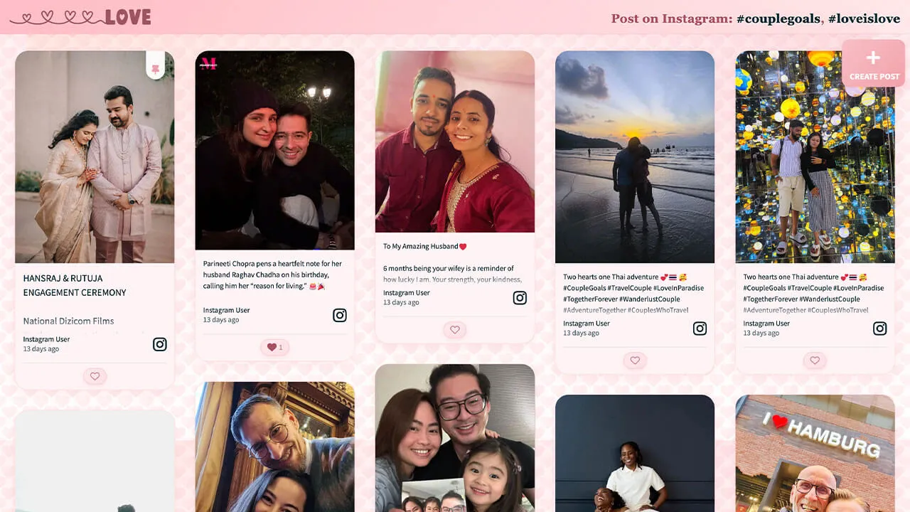
}Layout Love
Great for Valentine’s day and private engagement parties and wedding celebrations.
Customization highlights:
- Animated background (floating hearts)
- Branded gradient on header
- Custom pin and reaction buttons
How to implement
Head to Walls.io > Settings > Design.
Go to your wallMake sure you have selected the Fluid Layout and the color scheme "Light".
Copy-paste the following CSS snippet in the Custom CSS field.
/******************************************************
  WALLS.IO — "Amor" Theme
  • Hearts background
  • Light pink opaque posts
  • Text fade
  • Gradient header (white logo fix)
  • Styled pin icon
******************************************************/

/* --- Ensure visibility through embeds --- */
html, body, #app, .app, #wall, .wall, .content, .widget, .widget-body {
  min-height: 100%;
  background-color: #fff6f8;
}

/* === Theme Variables === */
:root {
  --heart-tile: 40px;
  --drift-duration: 90s;
  --header-grad-from: rgba(255,182,193,0.88);
  --header-grad-to: rgba(255,230,230,0.6);
  --instr-color: #a94f60;
  --card-bg: #fff3f5;
  --card-border: rgba(241,160,169,0.3);
  --accent: #f1a0a9;
}

/* === 1) Background (40px subtle hearts) === */
html, body {
  background-image:
    url("data:image/svg+xml;base64,PHN2ZyB4bWxucz0naHR0cDovL3d3dy53My5vcmcvMjAwMC9zdmcnIHdpZHRoPScxMjgnIGhlaWdodD0nMTI4JyB2aWV3Qm94PScwIDAgMTI4IDEyOCc+PGRlZnM+PGxpbmVhckdyYWRpZW50IGlkPSdnJyB4MT0nMCcgeTE9JzAnIHgyPScxJyB5Mj0nMSc+PHN0b3Agb2Zmc2V0PScwJScgc3RvcC1jb2xvcj0nI2ZmYzFjOCcvPjxzdG9wIG9mZnNldD0nMTAwJScgc3RvcC1jb2xvcj0nI2YxNzg4ZCcvPjwvbGluZWFyR3JhZGllbnQ+PC9kZWZzPjxnIGZpbGw9J3VybCgjZyknIGZpbGwtb3BhY2l0eT0nMC4xNSc+PHBhdGggZD0nTTY0IDQwYzgtMTggMzYtMTggNDQgMiA3IDE4LTcgMzItMjEgNDQtOCA3LTE2IDEyLTIzIDE5LTctNi0xNS0xMi0yMy0xOS0xNC0xMi0yOC0yNi0yMS00NCA4LTIwIDM2LTIwIDQ0IDInLz48L2c+PC9zdmc+"),
    url("data:image/svg+xml;base64,PHN2ZyB4bWxucz0naHR0cDovL3d3dy53My5vcmcvMjAwMC9zdmcnIHdpZHRoPScxMjgnIGhlaWdodD0nMTI4JyB2aWV3Qm94PScwIDAgMTI4IDEyOCc+PGRlZnM+PGxpbmVhckdyYWRpZW50IGlkPSdnJyB4MT0nMCcgeTE9JzAnIHgyPScxJyB5Mj0nMSc+PHN0b3Agb2Zmc2V0PScwJScgc3RvcC1jb2xvcj0nI2ZmYzFjOCcvPjxzdG9wIG9mZnNldD0nMTAwJScgc3RvcC1jb2xvcj0nI2YxNzg4ZCcvPjwvbGluZWFyR3JhZGllbnQ+PC9kZWZzPjxnIGZpbGw9J3VybCgjZyknIGZpbGwtb3BhY2l0eT0nMC4xMic+PHBhdGggZD0nTTY0IDQwYzgtMTggMzYtMTggNDQgMiA3IDE4LTcgMzItMjEgNDQtOCA3LTE2IDEyLTIzIDE5LTctNi0xNS0xMi0yMy0xOS0xNC0xMi0yOC0yNi0yMS00NCA4LTIwIDM2LTIwIDQ0IDInLz48L2c+PC9zdmc+"),
    radial-gradient(1200px 800px at 10% 0%, #ffe7e0 0%, transparent 60%),
    radial-gradient(1000px 600px at 90% 10%, #fde2e4 0%, transparent 60%),
    linear-gradient(180deg, #fff1f2 0%, #ffffff 100%);
  background-size:
    var(--heart-tile) var(--heart-tile),
    var(--heart-tile) var(--heart-tile),
    1200px 800px,
    1000px 600px,
    auto;
  background-repeat: repeat, repeat, no-repeat, no-repeat, no-repeat;
  background-position: 0 0, 20px 20px, 10% 0%, 90% 10%, 0 0;
  animation: amorHeartsDrift var(--drift-duration) linear infinite;
}
@keyframes amorHeartsDrift {
  0% { background-position: 0 0, 20px 20px, 10% 0%, 90% 10%, 0 0; }
  100% { background-position: 0 -300px, 20px calc(20px - 300px), 10% 0%, 90% 10%, 0 0; }
}

/* === 2) Header Gradient Fix (.socialwall_header) === */
.socialwall_header {
  background: linear-gradient(135deg, var(--header-grad-from), var(--header-grad-to)) !important;
  backdrop-filter: blur(8px);
  -webkit-backdrop-filter: blur(8px);
  border-bottom: 1px solid rgba(241,160,169,0.3);
  box-shadow: 0 4px 12px rgba(232,93,117,0.08);
  color: var(--instr-color) !important;
  z-index: 2;
}

/* === 3) Post instructions === */
.socialwall_header .post_instructions,
.wallsio-post-prompt,
.wallsio-createpost-prompt,
.createpost-instructions,
.header .instructions {
  font-family: "Playfair Display", Georgia, serif;
  font-size: 1.06rem;
  color: var(--instr-color) !important;
  font-weight: 600;
  text-align: center;
  text-shadow: 0 1px 2px rgba(255,255,255,0.6);
  letter-spacing: 0.3px;
  margin: 0.25rem 0;
}

/* === 4) Post cards (light opaque pink) === */
:root {
  --amor-card-shadow: 0 8px 24px rgba(232,93,117,0.12);
  --amor-radius-xl: 26px;
}
.checkin {
  background: var(--card-bg);
  border: 1px solid var(--card-border);
  border-radius: var(--amor-radius-xl);
  box-shadow: var(--amor-card-shadow);
  margin: 0.6rem;
  overflow: hidden;
  position: relative;
}
.checkin-media,
.checkin .checkin-image,
.checkin .checkin-video { border-radius: calc(var(--amor-radius-xl) - 6px); }
.checkin:hover .checkin-image img,
.checkin:hover .checkin-video video {
  filter: saturate(1.05) contrast(1.04);
  transition: filter .28s ease;
}

/* === 5) Create Post button === */
#createPostButton {
  background: linear-gradient(135deg, #f8bfc6, #f1a0a9);
  color: #fff !important;
  border-radius: 14px;
  border: none;
  box-shadow: 0 8px 18px rgba(232,93,117,0.25);
  transition: transform .2s ease, box-shadow .2s ease;
  margin-right: 12px;
}
#createPostButton:hover {
  transform: translateY(-1px);
  box-shadow: 0 10px 22px rgba(232,93,117,0.3);
}
#createPostButton svg path { fill: #fff !important; }

/* === 6) Like button === */
.like-button {
  background: linear-gradient(135deg, #ffe8ec, #ffdfe6);
  border: 1px solid rgba(241,160,169,0.4);
  color: #a94f60 !important;
  border-radius: 999px;
  padding: 0.35rem 0.75rem;
  font-weight: 600;
  font-size: 0.9rem;
  box-shadow: 0 3px 8px rgba(232,93,117,0.15);
  transition: all 0.2s ease;
}
.like-button:hover {
  background: linear-gradient(135deg, #f9c5cc, #f3a3b2);
  color: #fff !important;
  box-shadow: 0 4px 10px rgba(232,93,117,0.25);
  transform: translateY(-1px);
}
.like-button svg path {
  fill: currentColor !important;
}

/* === 7) Long-text clamp === */
.checkin .checkin-message,
.checkin .checkin-text,
.checkin .checkin-content,
.checkin .checkin-caption {
  display: -webkit-box !important;
  -webkit-line-clamp: 5;
  -webkit-box-orient: vertical;
  overflow: hidden;
  text-overflow: ellipsis;
  white-space: normal;
  line-height: 1.5em;
  max-height: 7.5em;
  position: relative;
}
.checkin .checkin-message::after {
  content: "";
  position: absolute;
  bottom: 0; left: 0; right: 0;
  height: 2em;
  background: linear-gradient(to bottom, rgba(255,255,255,0), var(--card-bg));
}

/* === 8) “No more posts to show” badge === */
.no-more-posts,
.no-more-checkins,
.wallsio-no-more-posts,
.wallsio-feed-end,
.checkins-end,
.timeline-end {
  display: inline-block !important;
  width: auto !important;
  max-width: calc(100% - 2rem);
  margin: 1rem auto !important;
  box-sizing: border-box;
  text-align: center;
  white-space: normal;
  padding: 0.6rem 1rem;
  border-radius: 999px;
  border: 1px dashed rgba(241,160,169,0.55);
  background: rgba(255,255,255,0.7);
  box-shadow: 0 6px 16px rgba(232,93,117,0.12);
  color: #b75a68 !important;
  font-weight: 700;
  letter-spacing: 0.02em;
  line-height: 1.2;
  position: relative;
  left: 50%;
  transform: translateX(-50%);
}
.no-more-posts:empty::after,
.no-more-checkins:empty::after,
.wallsio-no-more-posts:empty::after,
.wallsio-feed-end:empty::after,
.checkins-end:empty::after,
.timeline-end:empty::after {
  content: "No more posts to show";
}

/* === 9) Scrollbar === */
::-webkit-scrollbar { width: 10px; height: 10px; }
::-webkit-scrollbar-thumb {
  background: linear-gradient(180deg, #ffd1d9, #f7a3b1);
  border-radius: 20px;
}
::-webkit-scrollbar-track { background: rgba(255,255,255,.55); }

/* === 10) Header logo (white SVG) === */
.socialwall_header .app-logo.app-logo .image-wrapper svg {
  fill: #fff !important;
  stroke: #fff !important;
  color: #fff !important;
}

/* === 11) Pin icon === */
.checkin-pin-icon svg,
.checkin-pin-icon {
  fill: var(--accent) !important;
  color: var(--accent) !important;
  stroke: var(--accent) !important;
  opacity: 0.95;
  transition: all 0.2s ease;
}
.checkin-pin-icon:hover svg,
.checkin-pin-icon:hover {
  filter: drop-shadow(0 0 4px rgba(241,160,169,0.5));
  transform: scale(1.1);
}

/* Transparent fallback */
#wallsio, .wallsio-embed, .widget, .widget-body, .content {
  background: transparent !important;
}
Branding made easy
Aside from these customizations, you can easily add branding to your wall with our standard design editor.
Add your logo and link
Custom color tiles and headers
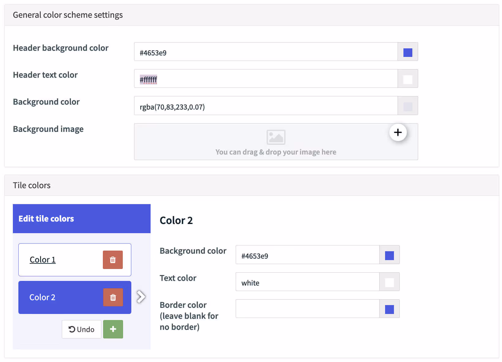
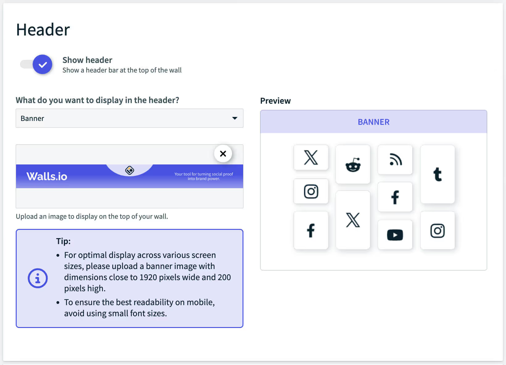
Upload a custom banner
Would you like to get a personal social wall demo with our experts?
.avif)


We'll answer all your questions and help you find the best setup for your brand.
Talk to us, we'd love to show you around.